
Custom graphs in mPower Analytics help you explore clinical and operational data by building visualizations tailored to your questions. You can analyze productivity, turnaround times, quality events, and other measures by using filters and interactive views.
Open custom graph
To start creating a custom graph:
Sign in to mPower.
Select mPower Analytics from the main page.
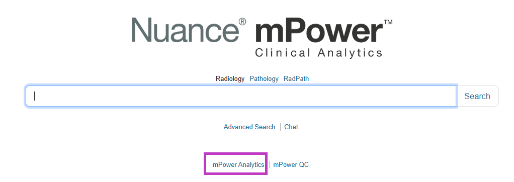
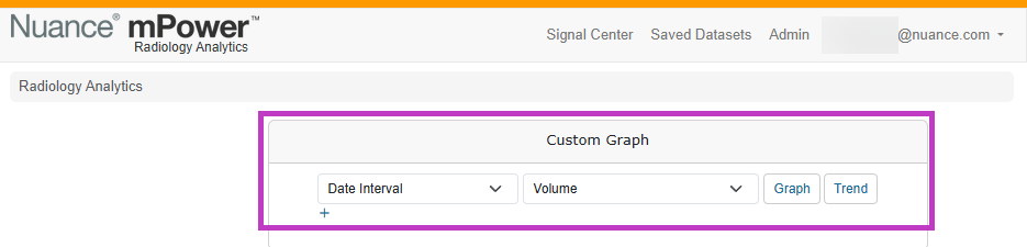
In the Analytics window, select Custom Graph.
The Custom Graph page opens with options to choose concepts, measurements, chart types, and filters.
Select concepts and measurements
Build custom graphs using two key elements:
- Concepts – what you want to analyze (for example, date, reporting provider, modality, organization).
- Measurements – what you want to measure (for example, volume, turnaround time, RVUs, or quality events).
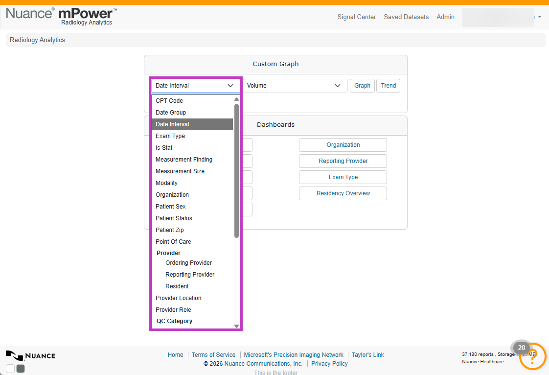
For example, you can analyze volume by reporting provider or turnaround time by date interval.
Choose how data is displayed
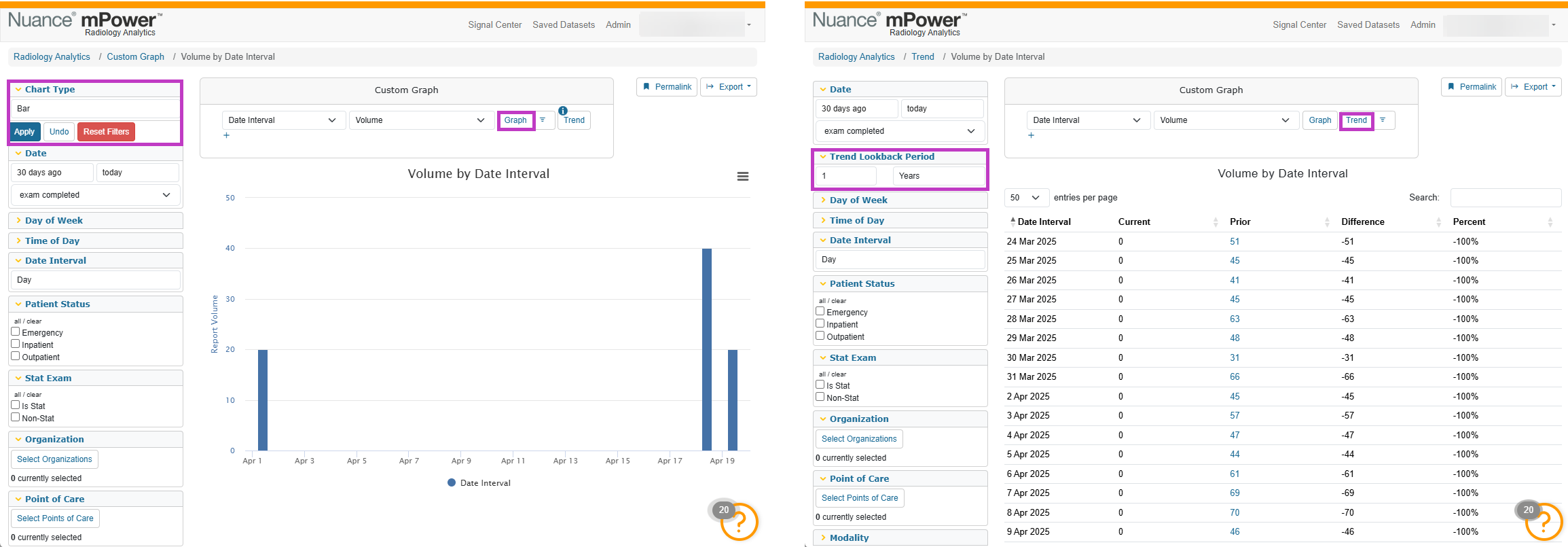
Select a chart type to control how results appear:
- Graph – visual trend or comparison.
- Trend – compare current results with prior periods.
mPower automatically selects a default view, but you can change it to match your needs.
Apply filters to refine your analysis
Use filters on the left side of the page to narrow your data, such as:
- Date range or smart date options.
- Modality or exam type.
- Organization or provider.
- Event type for turnaround time or quality measures.
Filters help you focus on specific time periods, workflows, or populations.
When to use custom graphs
Use custom graphs when you want to:
- Answer specific clinical or operational questions.
- Compare trends across time, providers, or modalities.
- Explore data beyond standard dashboard views.
Custom graphs complement dashboards by giving you more control over how data is analyzed and displayed.
Next up: Export analytics data
Export analytics data from mPower to Excel or CSV to review filtered results, recreate graphs, and continue analysis outside the application with confidence. Let's go